 If you really think about it, consciously or subconsciously, color affects our lives on a daily basis in very profound ways. Believe it or not, this fact has been studied since the middle ages, and has always been a crucial factor in interior design and décor for this reason. Color affects our thoughts, moods, behavior, feelings and emotions.
The first thing we think of when we want to decorate is what colors do we want to use and how they make us feel. So, when I start a new interior design project, my client consultation is about selecting style (modern, contemporary, traditional, transitional) and color. In many ways, they go hand in hand. It is important to know how we react to certain colors and this can change a lot with culture, gender and our age.
The amount of a certain color also affects the mood and senses, so this is an important consideration when selecting a primary color for a room. The base color you use can really affect your mood because colors can stimulate, calm or neutralize.Tones of color also have a big impact as light colors make a room feel spacious and airy, while dark colors are more sophisticated and give a room a cozier appearance.
Each of us has our preferred colors, but I wanted to give you a general reference guide on how to use color in your home based on human behavior and our senses . For even more tips, visit my Pinterest Board.
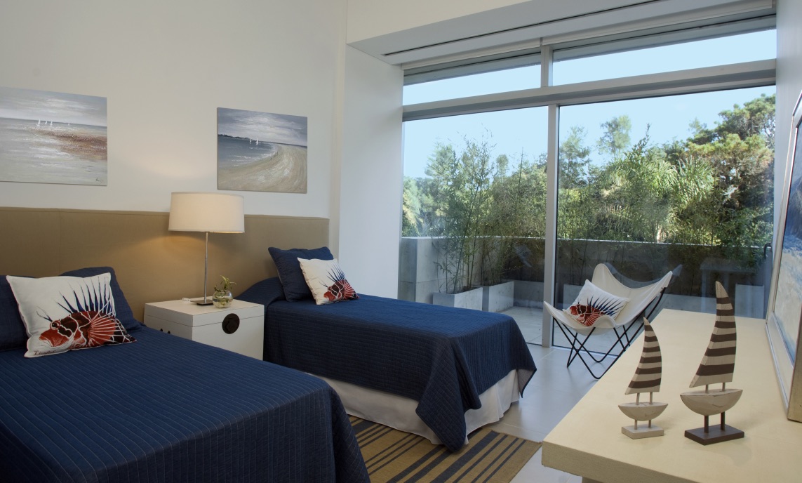
BLUE – has a calming affect when used as the primary color. Very serene. Inviting and trusting. It lowers blood pressure and heart rate and is known to decrease appetite. Choose lighter tones as dark blues have a somber feeling. Recommended for bedrooms and bathrooms. Pair with warm hues in furnishings and textured fabrics for a cozier feeling in the bedroom, as blue is considered to be a cool color. Studies show we sleep longest in a blue room. In a light tone, it gives a more expansive feeling to a small room.
GREEN – has a relaxing and restful affect and is known for stress relief. It makes us feel close to nature. You can use it in any room of the home. The obvious is the bedroom for rest and relaxation (in light tones) and it is said it also helps with fertility. I used it as an accent color in my kitchen, not only in the form of art and décor, but also by adding herbs and plants. When using it in a bathroom, it gives a sense of freshness. Often, it is used in a study, as it is also a color of concentration.
RED – very stimulating and even said to increase blood pressure and heart rate. Use sparingly and in muted tones. It can be used in an entry of a home because it makes us feel important. Light red is youthful, while dark red invokes power and durability. I like to use it in décor for accents. Often used in the dining room because it is known for stimulating conversation, but be aware that it also increases appetite.
YELLOW – gives a feeling of happiness and brightness. Nice to use in the entry, kitchen, family room, dining room and living. It is also good for small spaces as it gives the room a more expansive feeling and works well in poorly lit rooms for more light. An overdose of yellow creates just the opposite effect, evoking anger. Use in soft, buttery tones. Studies show babies cry more in yellow rooms.
ORANGE – like red, it is stimulating and increases energy. It makes us feel playful and friendly. I use it in décor rather than as a base paint color. It gives a nice lift to a room that is monochrome or neutral in color. It matches well with brown hues. In a softer tone, it is nice for the toilette.
PURPLE – luxurious, elegant, sensual, romantic and often synonymous with royalty. I love it in décor and for accent pillows in a rich texture, but would not use it as a base paint color other than for an accent wall.
PINK – projects a sense of youth and femininity. It is very soothing. Frequently used as base paint in girls’ rooms. I like it as an accent color in bathroom décor and for a splash of color in rooms with gray base.
BROWN – rustic and earthy. Projects a sense of security, stability and warmth. When used in paint, it gives a sense of depth and texture. Invokes outdoorsy feeling and pairs great with green. Often used in furniture and textiles. In a light tone is works as a great neutral base color for a room. I like to use it in a study.
BLACK – powerful, sophisticated and edgy. Used more in furniture, for accents and when highlighting. I prefer to use it in small doses. Works great in large spaces, like a loft.
WHITE – refreshing, clean, airy, and pure. Definitely the most versatile color and can be used in every room. Use in different tones to create different feelings. A bright white gives a crisper feeling and can make a room feel livelier, while an off-white tone invokes a sense of warmth. There are literally hundreds shades of white! Be aware of how it reflects light when used in rooms with a lot of windows. Also, white is great for contrasting or highlighting.
GRAY – very neutral and a good base color in light tones. It gives a subtle elegance and touch of formality. Could evoke a sensation of gloominess if in a room without natural light so use it in a place with a lot of windows. Different tones of gray evoke different sensations…. darker is more formal and traditional, while lighter is more modern.
I love hearing from you so please leave me a comment below and let me know what you think.

Colour psychology is so interesting because you don’t often notice it in marketing or in homes. I found it interesting that yellow can bring happiness and brightness as well as evoke anger when used to the extreme. My mother always told me that my bedroom would be more relaxing if I used primarily blue colours and I’ve heard that restaurants typically decorate with reds and yellows because the combination can make you hungry.